About
The dashboard tool allows users to create visual reports that draw from data collected across forms, workflows, and project activities. Dashboards can combine multiple types of content—including charts, tables, images, videos, and narrative text—to provide a comprehensive view of project progress and outcomes. Dashboards are created using a drag-and-drop interface that allows users to configure visualizations and organize information in ways that best reflect the needs of their program or audience. Data can be displayed in real time as new information is submitted through program workflows or field-level reporting. Dashboards can be created at the level of a single project or aggregated across multiple projects and sites, allowing organizations to analyze performance and outcomes across distributed initiatives. This flexibility supports a range of uses, from internal program monitoring to external reporting and impact storytelling. Key Features include:- Drag-and-Drop Interface: Easily arrange content modules for custom dashboard layouts.
- Multiple Data Sources: Connect live data (API, project data, web documents) or historical data (CSV, spreadsheets).
- Rich Content Modules: Images, videos, links, cards, image carousels, and more.
- Customizable Charts: Select from a wide range of chart types, including bar, line, funnel, pie, scatter, and radar charts.
- Flexible Layouts: Choose from various column configurations, text sections, and dividers for structured content presentation.
- Interactive & Shareable: Publish dashboards, share links, and embed content on external platforms
Quick Start
How to create a dashboard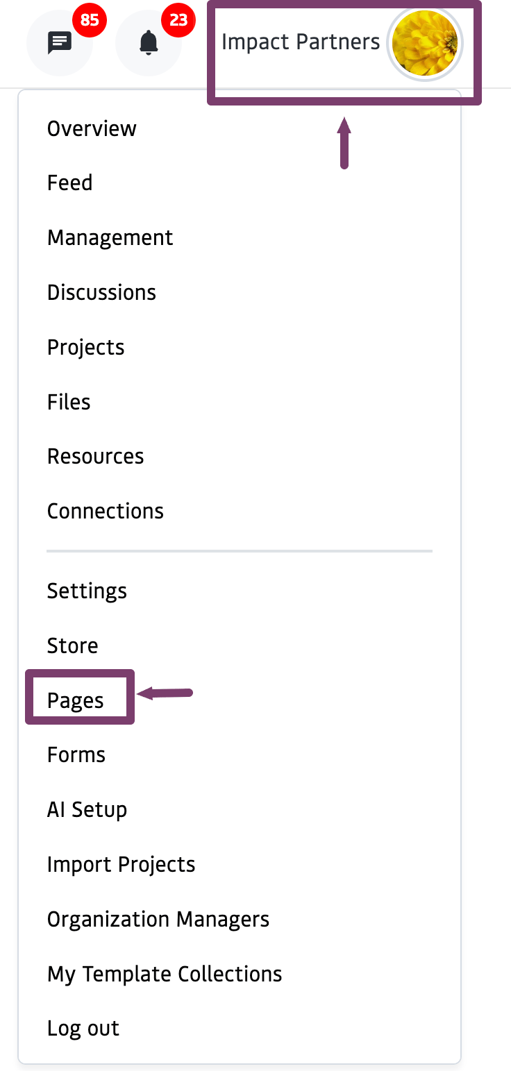
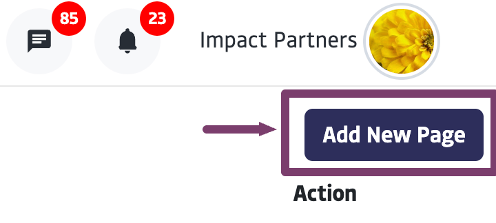
Start creating by clicking + Add Block
See additional information on using individual components below.
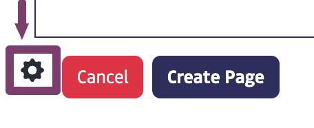
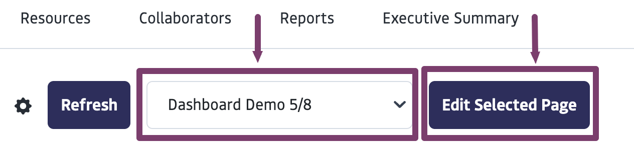
To Preview or Edit your Page:
- Once a page is saved, it will appear in the list when Pages is selected from the Menu.
- Click the gear icon to the right of the page title and name to edit or preview.
Working with Modules
The Dashboard Publishing Tool is built around modules, which are individual content blocks that users can add and configure. Each module serves a specific purpose, whether it’s displaying data, linking resources, or adding visuals.Creating a Layout
Formatting OptionsTo ensure your page is responsive and nicely spaced, we recommend dragging in a new container (with single or multiple rows) before you add each row of content. Available formats include single-column, two-column, three-column, and 3/7 split.
Adding modulesClick + Add Block to add modules to your canvas. It will then walk you through upload or configuration options with a popup window.
Connecting Modules to Data
Modules like Charts and Measurable Results require a data source to function. You can connect data in the following ways:- Live Data Sources: Pull real-time data from API integrations, project field data, or web documents stored in the system.
- Historical Data Sources: Upload CSV files, paste spreadsheet data, or manually enter historical data.
| Module Type | Use for | How to Use |
|---|---|---|
| Attachment | Use this module to attach files, documents, or external links, including YouTube/Vimeo videos. | Upload new files, attach existing files, or embed links. This includes Youtube and Vimeo links. |
| Image Carousel | Use this module to showcase multiple images in a scrollable format. | Upload new images or select from previously uploaded ones. |
| Card Module | Use this module to highlight key information with a title, description, and image preview. | Enter text and upload an image to format the card. |
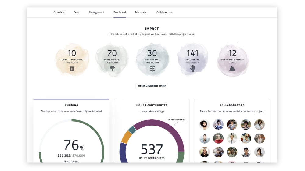
| Measurable Results | Use this module to showcase quantitative results from data captured through the measurable results reporting form or manually add results for completed projects. | Select ‘Auto update with live data’ to connect with the Measurable Results Reporting Form, which will automatically sync with project-related data; or manually enter data into the Measurable Results fields. |
| Charts | Use this module to visually represent data using various chart types. Area Chart: Best for showing trends over time. Line Chart: Best for continuous data comparison. Shows change over time. Bar Chart: Best for comparing values across categories. Funnel Chart: Best for illustrating a process with stages. Pie/Donut Chart: Best for displaying proportions, shows how a whole is divided into parts. Box Chart: Best for statistical distribution. Range Chart: Best for displaying high/low values. Bullet Chart: Best for performance measurement. Scatter/Bubble Chart: Best for correlation analysis. Radar Chart: Best for multi-variable comparison. Polar Line Chart: Best for cyclical data. | Configuring Titles, Axis Labels, and color scheme using the editor. Connecting to Live or Historical Data: Live data sources include project data, web doc (spreadsheets), and APIs. Historical data sources include CSV and manual spreadsheet entry. For detailed instructions, see “Connecting modules with data” below. |
Connect to Project Data
Charts can connect to existing project data in the platform. You can source data from multiple projects.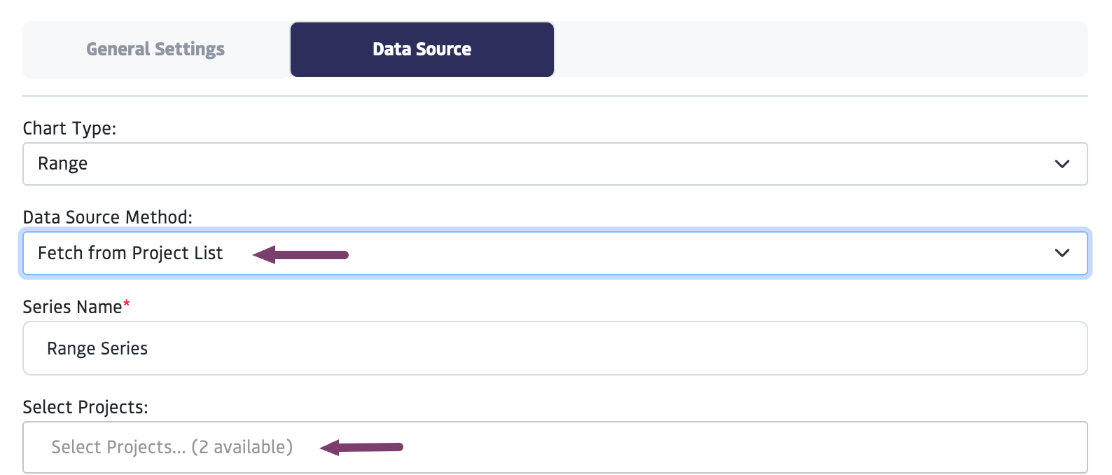
Select from the templates the form you would like to connect.
If you do not see a template, it means the project does not have any templates created.
Select specific fields you would like to appear in your chart, through the field titled “data keys.”
Connect to Spreadsheet Data
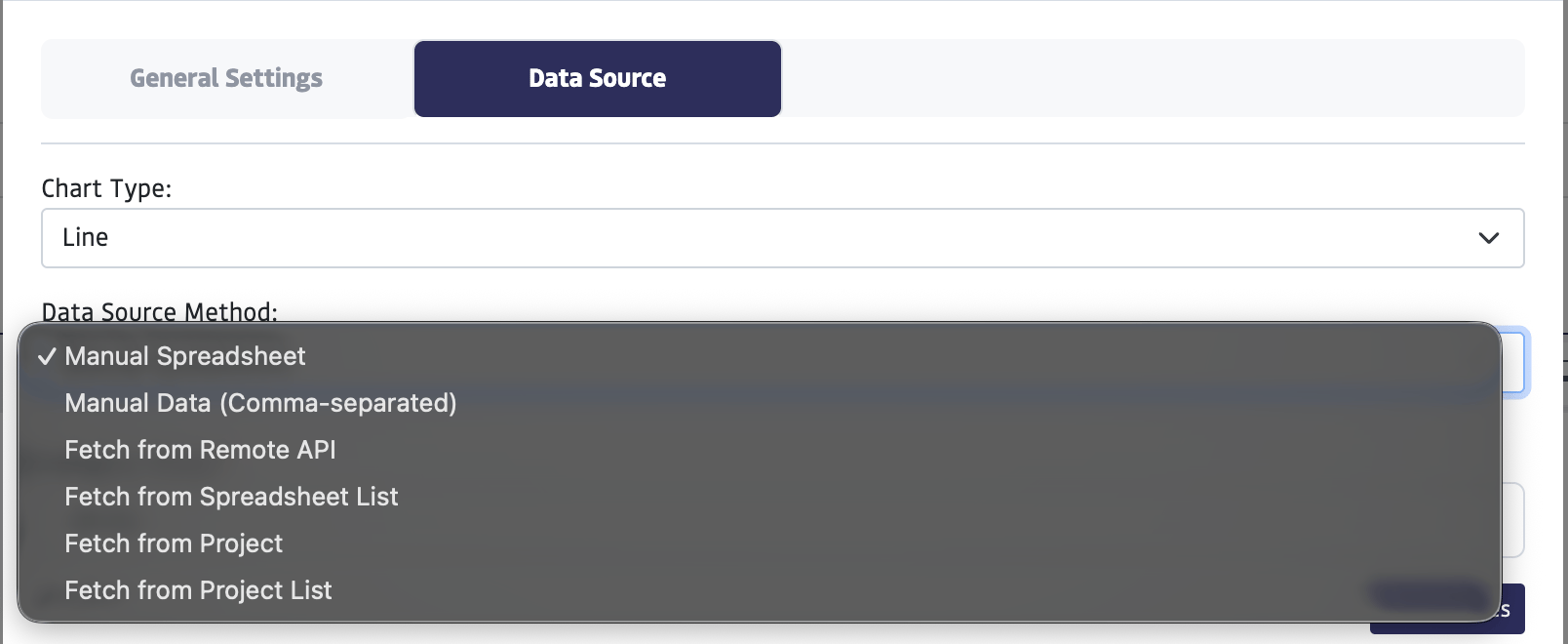
- For spreadsheets that you have created using the platform - in your files or under the attachment modal: Choose ‘Fetch from Spreadsheet List’ from the Data Source Method Menu and choose from previously uploaded Spreadsheets.
- To add data to a spreadsheet manually: Select ‘Manual Spreadsheet’ from the Data Source Method Menu and Enter data directly into the spreadsheet.
- To paste from CSV: Select ‘Manual Data (Comma-separated)’ from the Data Source Method and paste in data.
Connect to API
Choose ‘Fetch from Remote API’ from the Data Source Method Menu and enter the Remote URL. Please reach out to us directly at [email protected] if you are interested in exploring this option, and we can help you get it set up.Publishing and Sharing
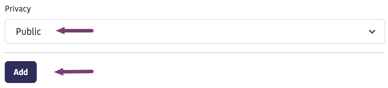
Dashboard Privacy Settings
The privacy settings control where you are able to share the dashboard and who can see it. To add privacy settings to a Dashboard:Under “Select Privacy”, select an option, and click “Add”
Privacy Types for Dashboards
- Public – Allows the dashboard to be shared a link to view the dashboard, even if they are not logged into the platform
- Private – Prevents the dashboard from being shared publicly. Visibility is restricted only to you or your organization and the projects you share it to.
- Connections – The content is visible to all of your direct connections
- Custom – This allows for specific sharing rules, such as sharing with:
- All groups
- Specific groups
- Specific individuals
- With “allow” or “not allow” rules
Publish a Dashboard to a Project
This step allows you to display a dashboard within a specific project’s “Dashboard” tab. Follow these steps once you have created the dashboard.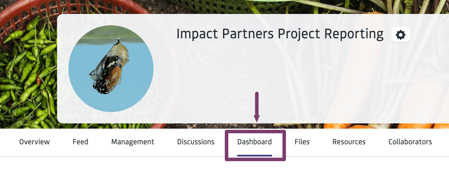
Share a Dashboard URL
If the dashboard is set to public, you can share the page through a URL. To set the dashboard to public:Navigate to edit the dashboard
To do this, select your icon in the top right, then “pages”, then select “Edit” under the gear next to the dashboard you want to work with.
Scroll to the bottom of the dashboard. Click on the gear icon at the bottom the page, this will open the privacy settings.